Borcelle insurance

Project
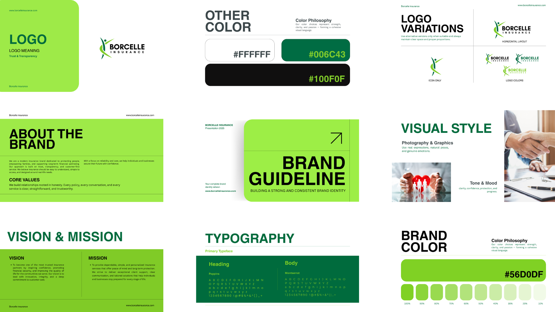
Borcelle Insurance is a forward-thinking insurance provider committed to offering reliable, transparent, and customer-first protection solutions. For this project, our goal was to develop a meaningful and trustworthy brand identity that reflects security, care, and continuous growth—values that form the foundation of any successful insurance organization.
The final logo embraces movement, protection, and positivity, creating a strong and memorable identity that resonates with clients across all touchpoints.
Our Customers Challenges And Desires
Our client needed a brand identity that goes beyond traditional insurance visuals. They wanted a symbol that communicates protection, trust, human connection, and a vision for a secure future. The identity had to be modern, professional, and suitable for both digital platforms and offline materials.
01. Building a Professional & Trustworthy Brand Image
Borcelle Insurance wanted a visual identity that captures the essence of security and human well-being. The abstract human figure in the logo represents care, support, and assurance, while the flowing curves symbolize protection that surrounds you.
The challenge was to create a mark that feels warm, professional, and universally relatable, appealing to families, individuals, and businesses alike.
02. Creating a Seamless and Conversion-Focused Digital Experience
The client aimed for a brand image that stands confidently alongside global insurance names. We crafted a clean, dynamic logo with a harmonious balance of curves and structure.
The green color palette represents growth, safety, and renewal, reinforcing the brand promise of a secure and positive future.
This premium identity ensures that Borcelle Insurance maintains a strong presence across all platforms—from websites to business cards to policy documents.
View Full Presentation
Details
Time
3-4 Days
Category
Branding & Logo Design
Location
North America
Brand Name
Borcelle insurance
